'I'm Buying' List
6. Chicago Red Stars
Proud to introduce our new front-of-jersey partner, @Wintrust 🤝
— Chicago Red Stars (@chicagoredstars) February 27, 2024
They'll be prominently featured on our 2024 Primary and Secondary kits.
Pre-sale + more content coming soon 🙌
For me, it's a busy kit. For others? It's perfect.
Chicago has a history of incorporating their city into their kits. This is a major step down from previous years' kits — think back to the Foundation Kit, Skyscraper Kit and Elevated Kit. But, the Red Stars get points for creativity and uniqueness.
Listen, for me, the colors clash. But there is one detail that reigns supreme for me. Look at the crest in the top right corner. Yes, it's a new look for the Red Stars — who are hoping the 2024 season will erase sins of the past, both in terms of front office and the lackluster 2023 season. But, if you look closely, you'll see how the different patterns all connect with the crest. It's a neat detail.
Now, the second kit, it's a plain blue shirt. However, contrast in color from the vibrant, blue and white kit, is a nice color. Also, did you notice that Chicago has a new front-shirt sponsor?
5. Kansas City Current
Two new kits. One historic season.#KCBABY pic.twitter.com/3vt3aADa6u
— KC Current (@thekccurrent) February 27, 2024
Kansas City, you've done it again. There is something about Kansas City's color palette just makes sense. The red and the teal blue together are a smooth combination. The white sponsor on front of the red primary kit doesn't clash. It's just a good kit, and the color is extremely vibrant.
Kansas City also took a note from Gotham FC. We haven't seen the shorts for Gotham, but I love that Kansas City's shorts bled so well with the top on the white kit, with hints of teal ombre coloring. Also, the white part of the kit isn't boring. There is a certain texture-type design on it that looks neat.
Kansas City, as mentioned above, had some pretty bland kits for their first season in the league, in 2021. However, since then, the Current have stepped up, creating some of the best kits in the last handful of years.
4. San Diego Wave FC
SD in every stitch 🌊 @KPSCALnews pic.twitter.com/n12engE68u
— San Diego Wave FC (@sandiegowavefc) February 27, 2024
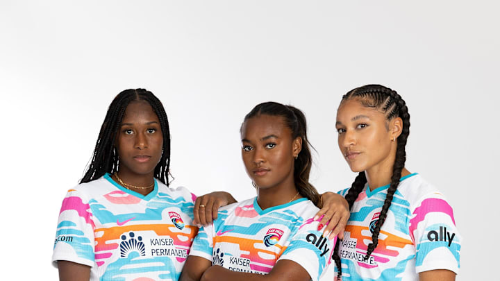
Sadly, I have to tell you to ignore the blue 'wave' kit in this batch. That is technically the pre-match training top for the San Diego Wave. That's a shame, because this batch of kits would've been much higher if that replaced the white (plus orange, pink and blue kit).
Once again, the random patterns aren't necessarily my thing, but San Diego's kit looks very retro, so it works well. When you think of the San Diego Wave, you think of beaches, thanks to the club's nickname, so the bright colors work well together. Once again, it's not a plain white kit, so points for that.
Usually, solid-colored kits are ranked lower on the list, but the creativity of San Diego's primary retro kit moves this up the list. Also, if you are going to have a solid-colored kit, pink is the best move. I mean, did you see the Barbie movie?
