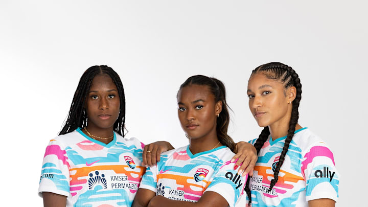
The 2024 NWSL kits are here!
Recently, the National Women's Soccer League and Nike agreed to a league-wide rebrand on uniforms. Gone are the old shirts from last year, and a new, vibrant color scheme is sweeping the league. Included in the new releases are a primary and secondary kit. Third kits are not on the slate for this season, but could be in years beyond.
"This launch marks a pivotal moment for the NWSL as we join forces with Nike to introduce a visually striking, bold and community-inspired kit collection for all 14 clubs,” NWSL Vice President of Consumer Products Katie Eaton said. “We understand the importance of creating a range of products, from training gear to match uniforms, that effectively serve the needs of our players on the field while also ensuring that kit designs resonate with the fans who support and celebrate their teams with passion.”
"This historic uniform refresh with Nike exemplifies our continued commitment to raising the bar and elevating the NWSL brand with vibrant kits that symbolize the powerful connection between the clubs, players, fans and our communities,” NWSL Chief Marketing and Commercial Officer Julie Haddon said. “We are excited to build upon this energetic moment as we approach our 2024 season kickoff.”
Take a look as we rank the kits across the league. There are 14 clubs in the NWSL. The kits will be in the following categories: It's a Shirt, Eye-Turners, 'I'm Buying' List and Divine and Immaculate.
Please keep in mind, the kits are being ranked on the following criteria: uniqueness, creativity, color and, of course, personal preference.
It's a Shirt
Follow MLS Multiplex on X (Twitter).
14. Bay FC
Presenting #BayFC’s Inaugural Season Kit 🤍🩶
— Bay Football Club (@wearebayfc) February 27, 2024
Available now at https://t.co/Jp8UzzVSkO
The newest club in the NWSL has a... boring shirt.
Don't get me wrong, the different-colored badges are cool, especially the salmon-orange badge on the black shirt, but aside from that, there is no design. The white shirt essentially has white with a hint of gray. The black shirt is... a black shirt.
For a first-year club, it's a boring look. However, in their first year, the Kansas City Current were pretty boring, but ended up creating excellent kits down the road. Bay FC, take notes.
13. Angel City FC
Grit + Joy fuel our journey, and together, we'll overcome every obstacle.
— Angel City FC (@weareangelcity) February 27, 2024
Angel City FC's uniform isn't bad, by any stretch of the imagination, but the color palate is just boring. The pink creamy kit is an aesthetically pleasing kit on the eye, with the pastel-shade, but the angel wings on the black kit a little... bold.
They don't really match up well, with the lighter gray clashing with the darker gray. If the lighter gray wings were removed, it would be higher on the list.
12. Washington Spirit
Introducing our 2024 kits with @CVSHealth!
— Washington Spirit (@WashSpirit) February 27, 2024
A new burst of energy & vibes for 2024 😎
There's something about tradition that is simply beautiful. Teams in the D.C. metro area have always displayed patriotic branding colors: red, white and blue. D.C. United changed it up, going with a black, white and red combination. But still, it includes 2/3 colors that help define the U.S.
The Washington Spirit have not officially announced a rebrand, but recent preseason messaging and training outfits suggest that one is coming. Is this light yellow part of the rebrand? If so, it runs away from the tradition of D.C. metro teams. That's a shame.
In regard to this year's uniforms, the plain yellow one is simply that: plain. The black kit is automatically written off due to the asymmetric, well, lining up. It's not easy on the eyes. It's toward the bottom of the pile for me.
11. Utah Royals FC
How we’re walking out on 3.16 ⛰️ pic.twitter.com/7fAf68zCly
— Utah Royals (@UtahRoyalsFC) February 27, 2024
Utah, Utah, Utah. I understand you're a new club, but ripping out a page from the 'old' playbook isn't a crime — and would have been a serious benefit. It's not shown above, but there is a blue kit as well, which is simply navy blue, with the logo plastered on the top right.
Look at the tweet below. In 2020, the Utah Royals debuted this bad boy: the mountain kit. That is a really hard kit to top. Utah is different this time around than in 2020. There are new owners, a new logo and a whole new identity.
New Utah Royals primary kit is navy, with a gold outline of the Wasatch Mountains that overlook Rio Tinto Stadium. I like the local tie-in, and the colorway is sharp. Slight bummer they ditched the yellow primary to be yet another blue team. Overall design is a big win. #NWSL pic.twitter.com/s6kq8TdphU
— Jeff Kassouf (@JeffKassouf) June 17, 2020
Of course, with a new rebrand, the Royals aren't going to do a copy-paste of the old uniform. However, something mountain related would've made sense. Real Salt Lake did it this season — although, to be fair, their mountains are quite clashed in their kit. This was a big missed opportunity for Utah's big 'welcome back' to the league.
