Soccer off-season is more than just transfer rumours, playoff predictions and debates. It’s a time we get to see the unveiling of some intriguing or historical designs. Who’s got the best kit?
Fashion and Soccer Apparel have gone hand in hand for decades now. With past jerseys and full kits being regurgitated in second-hand clothing stores to be worn as an everyday top, contrary to their original purposing.
Every now and again a club drops a new shirt that’s an instant classic. An instant hit. And one that even if you don’t have ties to the club, makes you want to add it to your collection of football shirts.
We see this a lot with some of the super European clubs, such as; Juventus, Real Madrid, Barcelona and PSG. Whether it’s an eye-catching shirt sponsor, like Jeep on a Juve shirt, or a colour pattern that’s seriously inviting, such as most Barcelona kits…ever. These shirts almost say something more than just football. It becomes a culture.
In England, it’s vital that clubs kits don’t break the trend of the clubs’ traditions. Whether that means upholding the clubs’ core colours or simply designing one kit per year that has a retro feel to the particular fanbase, it’s pivotal that designers don’t get too excited and come up with a variety of kits that fail to symbolise the club in any manner.
MLS fan culture mirrors the mentality that can be found in England and the rest of Europe when it comes to upholding clubs values and traditions.
This coming season, MLS has already seen one complete branding shakeup with the re-launch of Montreal Impact as CF Montreal. Along with a new name, comes a new badge and in turn a sleeker kit. The switch-up has carried mixed reviews, but I’m all here for the new Montreal.
CF Montreal feels like a dive into their French routes. Montreal has always been a predominately French region of Canada, who’s national languages are both French and English. Club De Foot Montreal is a stride into crafting new history. The new club badge may take a second to get used too, as it definitely feels like they’ve gone down the minimal approach here, but the 2021 home jerseys in a jet black base with popping blue Adidas stripes is serious. The shirt sponsor has even gone all sleek on us too as well as the club badge icon appearing printed across the kit in a lighter, textured black.
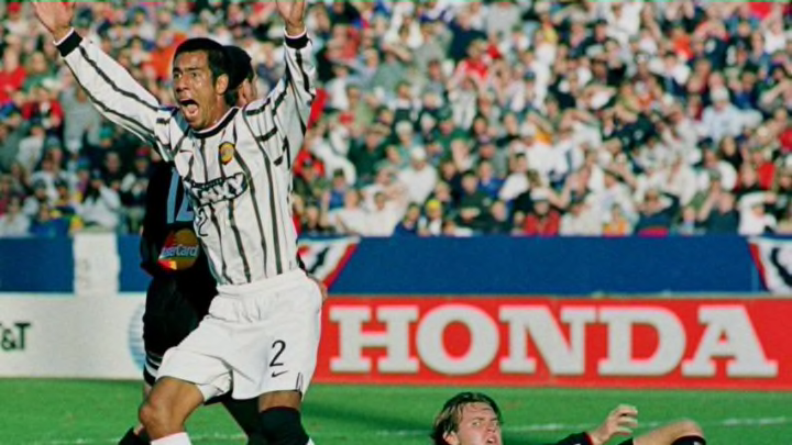
On to the infamous LA Galaxy. I’ve always loved an LA Galaxy shirt. Usually, their home jerseys grab my eye. This coming season, their freshly dropped community kit has sent my jaw through the floor.
The colours, the stripes, the black base on the back, the sponsorship continuing to work well amongst their designs, the badge and the stars. It’s tiring to even try and find faults with the Galaxy’s new community kit. It’s one that could rock up in European streets and gyms and fit right in amongst some of PSG’s and Barca’s iconic designs. Still, football fashion is subjective. And that’s how I see the Galaxy’s community jerseys.
I know what you’re thinking, “where has this guy been? They’ve done this before?” And you’re right, they had these jerseys in the late 90’s, and remade the community prints in different designs and colours on a few occasions in the last 20 years. However, to see the 90’s version back, modernized and not ruined, ready to go again, is always exciting.
Moving north to the Portland Timbers. It’s another club that has recently dropped their upcoming seasons home kit and received mixed-reviews. TikTok can be found as a sponsor on their sleeve. And whilst it is quite tricky to go wrong with two shades of green and some gold trim, the colour and stitching pattern almost push this Jersey into the ‘too much’ category of football shirts. All in all, the more I look at it, the more I like it. So that can’t be a bad thing, right?
Within the coming weeks, we’ll have more finalized imagery and backstories on all the 2021 kits for MLS clubs this season. For me, it’s always one of the most important periods of the off-season/pre-season time-period. Everyone wants their club to release a kit that makes them proud, showcases the history and tradition of the team and importantly, looks great to wear.
